Client Overview
The Save Point is a locally owned video game store and community hub that brings gamers of all ages and experience levels together. Known for its inclusive atmosphere, curated game selection, and regular in-store events, the shop has become a trusted part of its local gaming community for over a decade. As the store continues to grow, The Save Point is looking to expand its presence online with a cohesive, user-friendly website and visual identity. The goal is to translate the welcoming, community-driven in-store experience into a clear and engaging digital platform that promotes events, highlights inventory, and supports long-term growth.
Context
While The Save Point had a strong in-person identity, its digital presence did not fully reflect its community-driven values. The website needed to serve multiple audiences—from dedicated gamers to parents shopping for gifts—without overwhelming users.
Objective
- Create a clear and welcoming UI system
- Support both gamers and non-gamers
- Promote events and community engagement
- Maintain consistency across multiple pages
Design Approach
Designing The Save Point’s website began with understanding the emotional and psychological needs of its two
core audiences: younger gamers seeking excitement and connection, and adults looking for clarity,
confidence, and guidance. The interface uses warm colours, friendly microcopy, and subtle gaming-inspired
elements to create a welcoming, energetic, and trustworthy experience while reducing intimidation for
first-time visitors, especially parents.
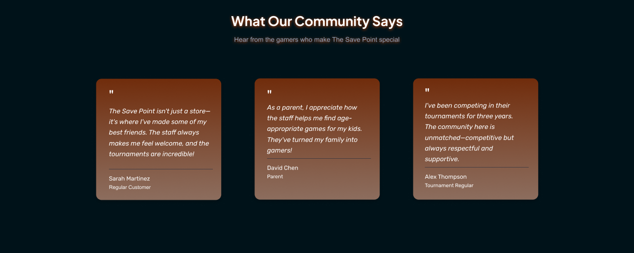
Community and trust are reinforced through social validation. Visual highlights from tournaments,
community photos, and testimonials help younger users feel a sense of belonging, while reassuring parents
that the store is established, inclusive, and safe.
Reciprocity is built into the experience by offering value through early access to event
announcements, simple guides for parents, and small exclusive perks. These gestures help users feel
appreciated and encourage return visits.
To reduce cognitive load, the layout is structured around clear pathways such as Shop, Events, and
Games. Simplified choices prevent decision fatigue and ensure that both gamers and non-gamers can quickly
find what they need, whether it’s age-appropriate gift suggestions or upcoming tournaments.
Scarcity and gamification are introduced subtly. Limited retro inventory and real-time event
availability encourage timely engagement, while light gamified elements reward participation and support
long-term community involvement.
Together, these design considerations create an experience that feels intuitive, reassuring, and
enjoyable, supporting both user needs and The Save Point’s goal of strengthening community engagement and
growing its digital presence.
Demographics
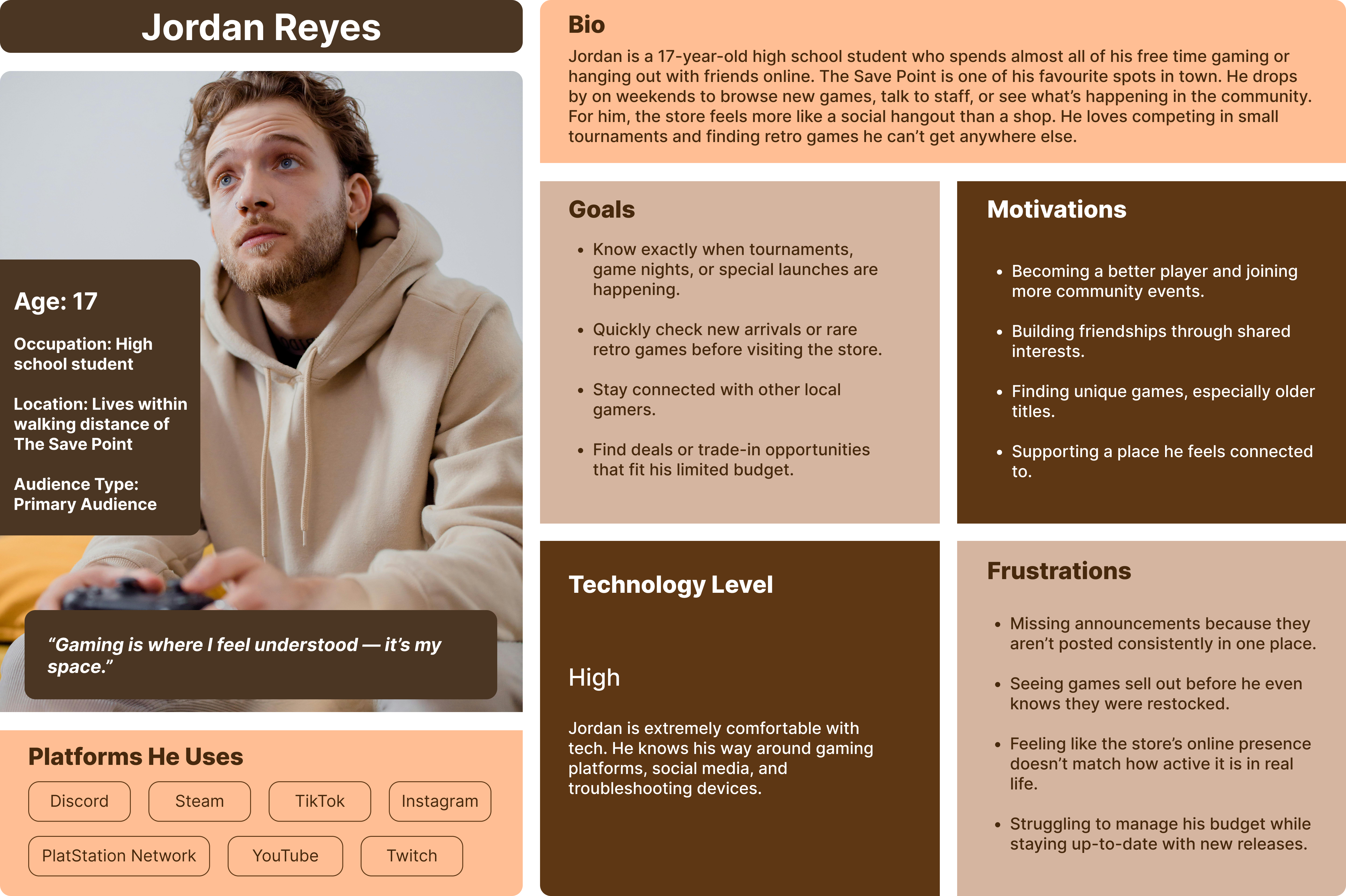
Primary Audience: Local Gamers
The Save Point’s primary audience consists of local gamers, primarily teens and adults aged 13-24, who visit the store regularly and play video games as a hobby. Most customers are English-speaking, with a small number of multilingual community members, and the audience is gender-inclusive, reflecting the store’s commitment to creating a welcoming environment for players of all backgrounds. Typically living nearby, these customers tend to include students or working professionals, meaning their technological skill levels generally range from moderate to high. Common barriers may include budget limitations, especially for younger gamers or adults supporting families, as well as accessibility needs that must be considered for the store to thrive as an inclusive pillar of its community.
Primary persona
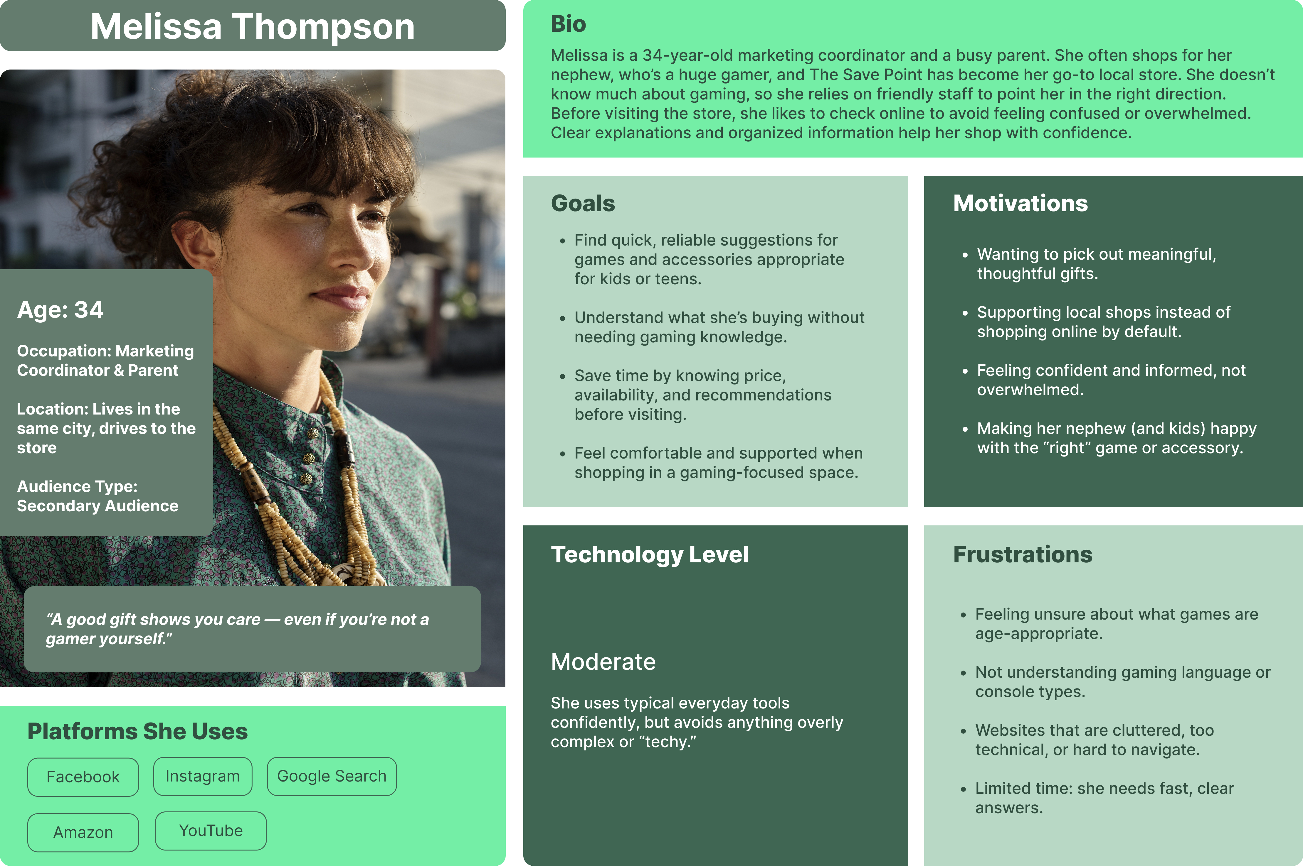
Secondary Audience: Parents/Relatives looking for gifts
The Save Point’s secondary audience includes parents/relatives who shop for the gamers in their lives. Primarily adults aged 25-50, as well as Grandparents, are also often local residents, but can also include visiting relatives from nearby cities who happen to be visiting. Primarily English speaking, there are multilingual visitors whose needs must be represented. Many are working professionals with varied technological familiarity, though they often lean more towards being inexperienced. Because they may come in seeking recommendations or assistance, this audience typically has limited gaming knowledge and can feel intimidated entering a specialized space for the first time. Additional barriers include time constraints, a need for straightforward information, and accessibility considerations that must be addressed to ensure they feel supported and welcome. We can identify the primary and secondary audiences of The Save Point by directly observing who visits the store and engaging customers in casual, friendly conversations about their needs, habits, and reasons for coming in. These are time-intensive methods, but also effective for ensuring we’re focusing on the right demographics.
Secondary persona
Website Design
The final UI design presents The Save Point as a trusted, community-focused brand through a cohesive visual language, clear information hierarchy, and responsive layouts. The website supports intuitive browsing, easy discovery of games and events, and meaningful engagement across desktop and mobile devices
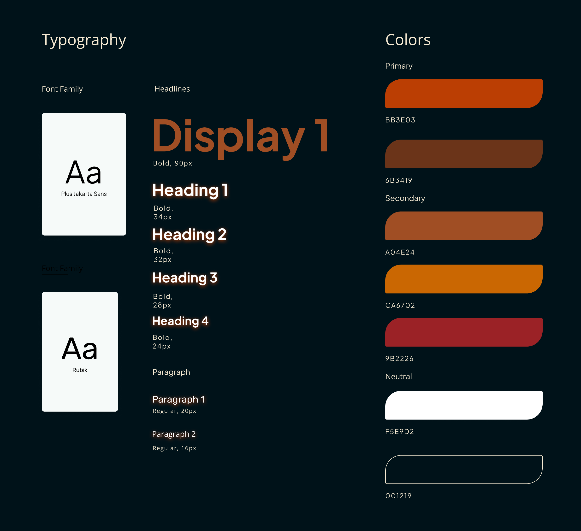
Style Guide
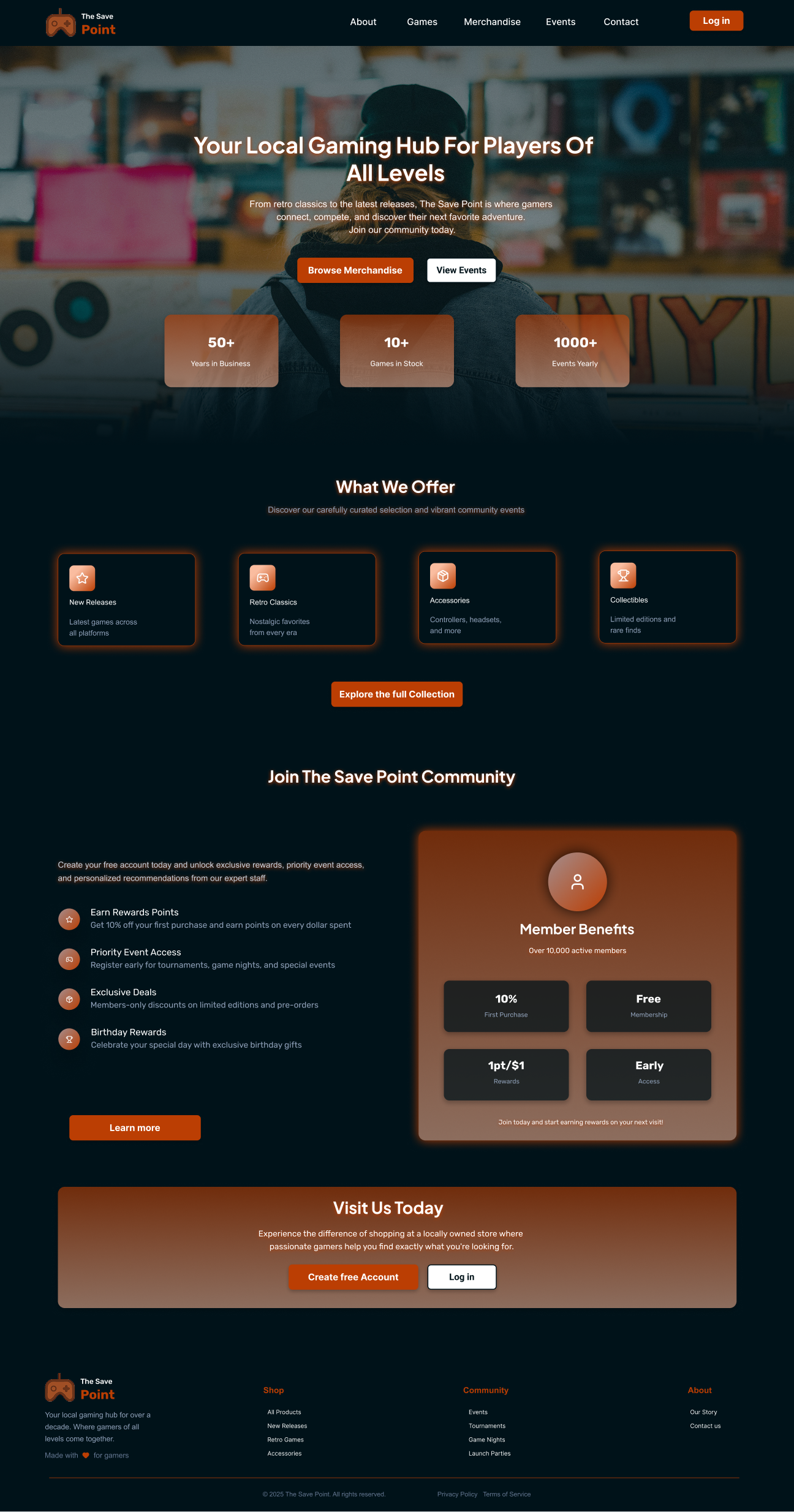
Home page
Components
Modern, interactive hover states add visual feedback and depth, making components feel responsive and engaging without overwhelming the interface.
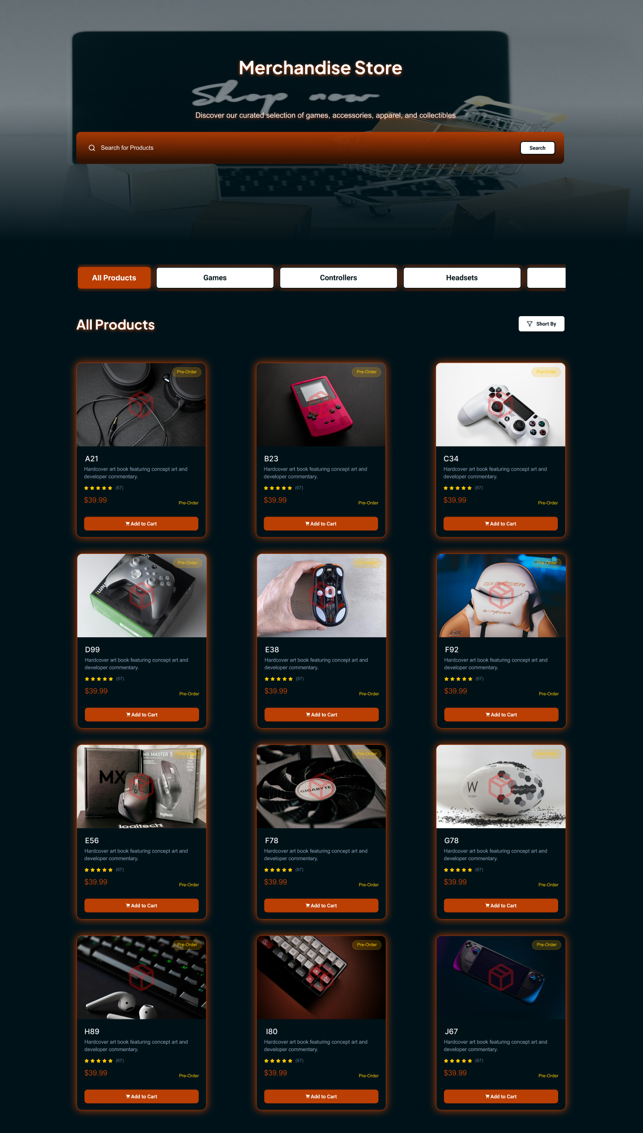
Merchandise page
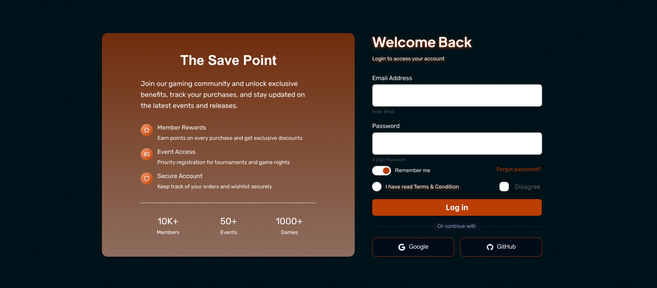
Login page
Social Validation
Accessibility & Usability
- Clear visual hierarchy and spacing
- Readable typography and contrast
- Touch-friendly buttons for mobile
- Consistent navigation patterns
Outcome
The final website design successfully translates The Save Point’s in-store community experience into a cohesive digital platform. The interface feels welcoming, easy to navigate, and visually consistent across devices, allowing users to browse games, discover events, and engage with the brand confidently. By balancing clarity for parents with excitement for gamers, the design strengthens trust, encourages repeat visits, and supports The Save Point’s goal of growing its community and online presence.
Interactive Prototype
If the embed doesn’t load, open it in Figma: View prototype
Learning
This project reinforced the importance of designing for multiple user groups within a single interface. Balancing the excitement expected by younger gamers with the clarity and reassurance needed by parents required careful use of hierarchy, tone, and interaction design. I learned how subtle visual cues, simplified navigation, and well-designed micro-interactions can reduce cognitive load while still keeping the experience engaging. The project also highlighted how integrating psychological principles into UI decisions helps create designs that feel intuitive, trustworthy, and emotionally resonant rather than purely visual.