Design Process
The project began with low-fidelity wireframes created in Figma to structure content and user flow across desktop and mobile devices. These wireframes helped define navigation, layout hierarchy, and key interactions before moving into visual design and development.
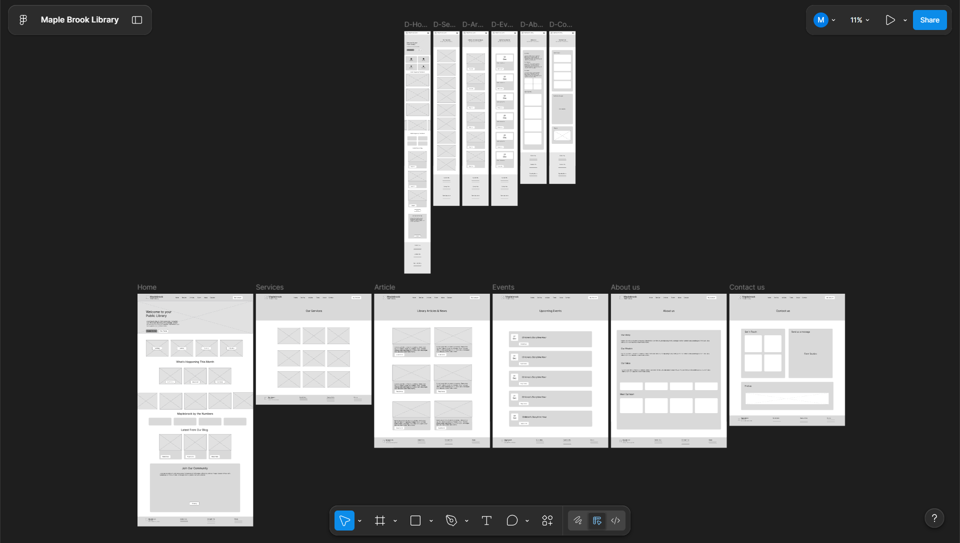 All Pages Wireframes (Desktop & Mobile)
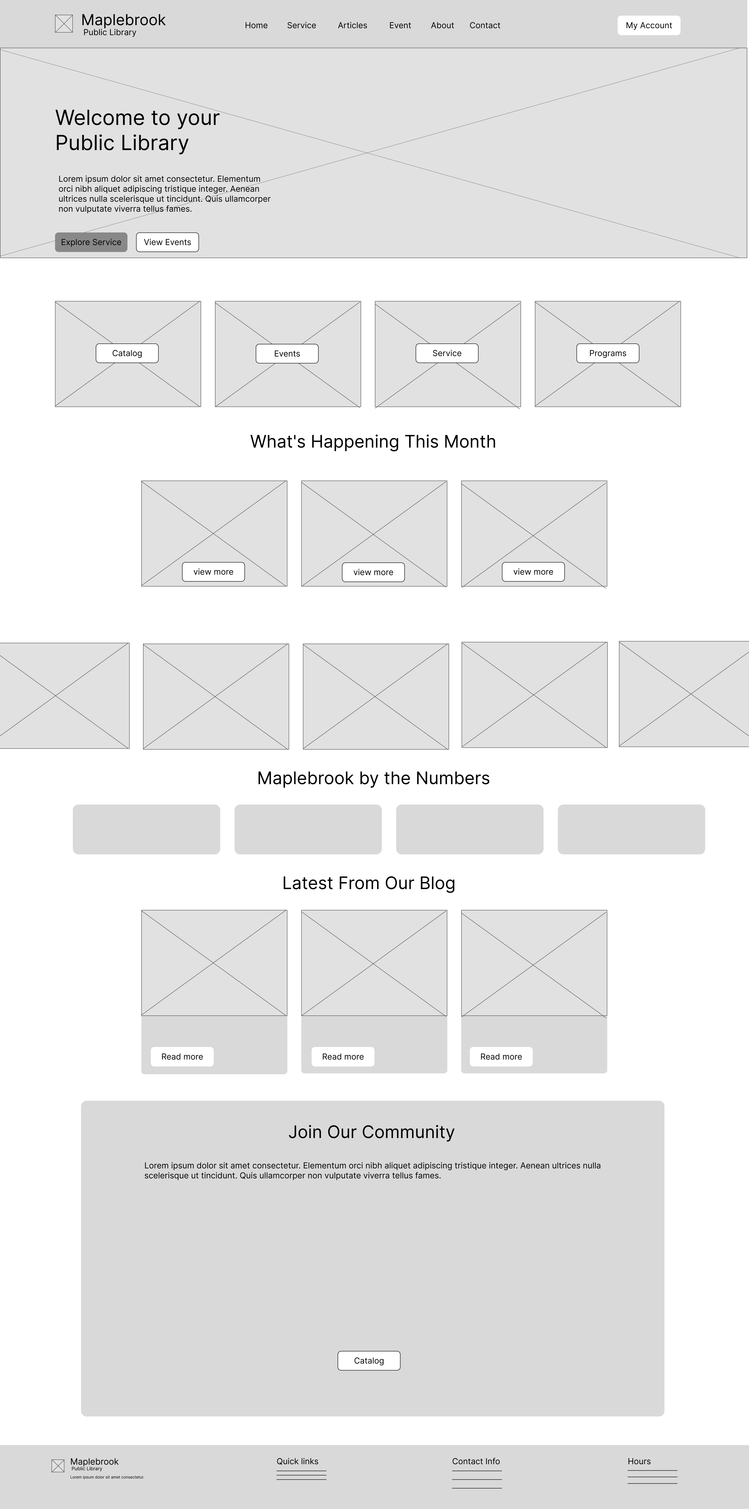
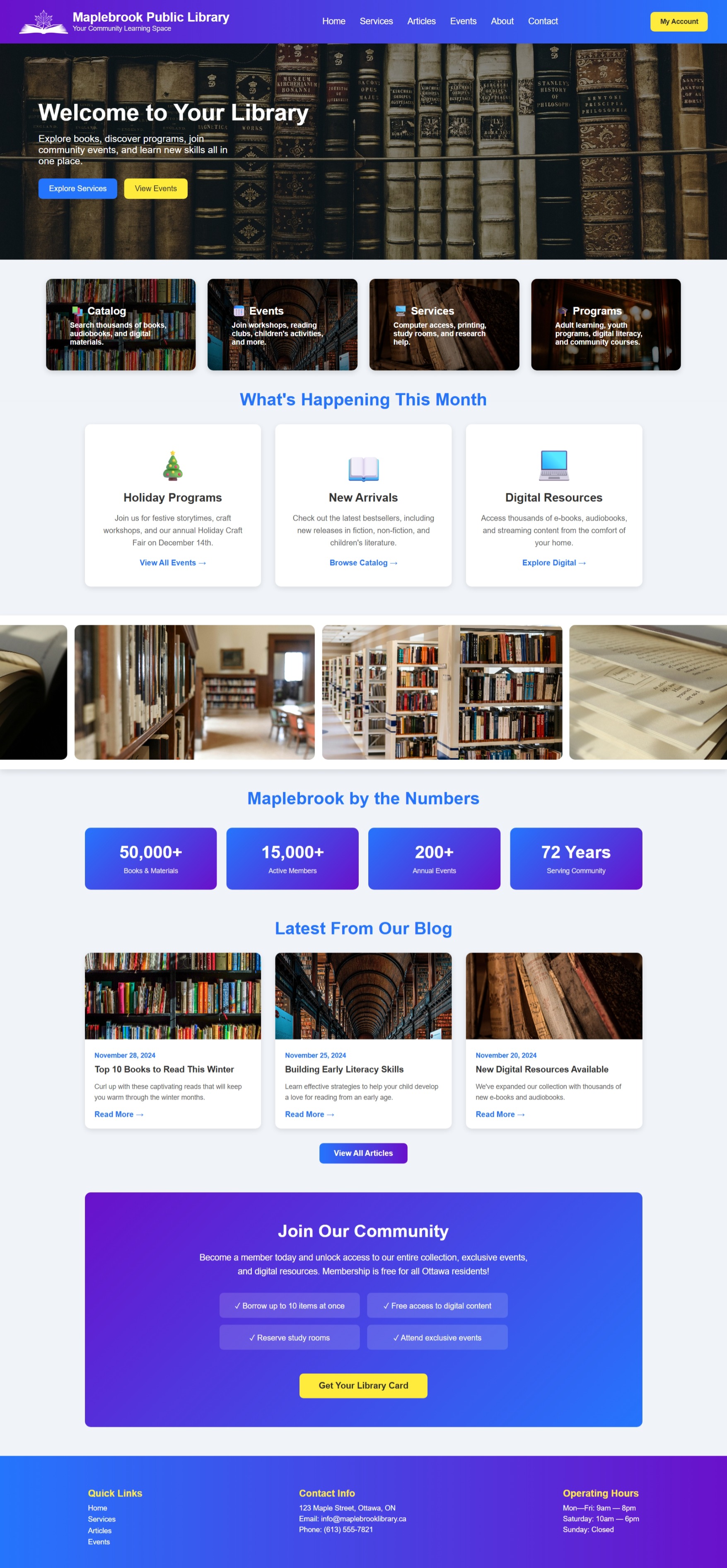
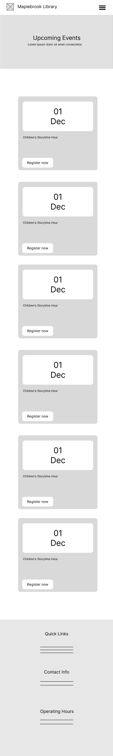
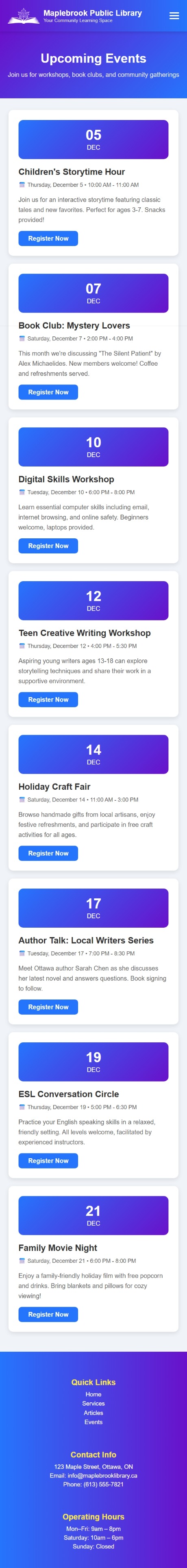
Wireframes to Final Design
Each page evolved from structured wireframes into fully responsive, visually polished web pages. Below are examples comparing the wireframe concepts with the final coded website.
Homepage
Events Page (Mobile)
Live Website
The final website was fully developed using HTML, CSS, and JavaScript and deployed on GitHub Pages. You can explore the live version below.
Open in New Tab ↗